San Francisco Chronicle, 26 Dec 2013, art critic Kenneth Baker:
Looking back at art in 2013: Top Ten Shows in Bay Area
Number 7--Ward Schumaker: The Years of Pretty: Selections From Ten Years of Work
The Jack Fischer Gallery's inaugural show at its Potrero Flats location reintroduced a San Franciscan in his 70s whose work would earn him world recognition, were there any justice.
__________________________________________________________________________________________________________
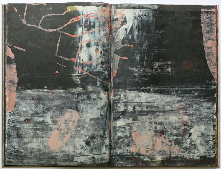
San Franciso Chronicle, 6 September 2013, art critic Kenneth Baker:
Ward Schumaker's hand-painted book real page-turner
White gloves on a table in an exhibition offer an invitation to don them and page through a series of artworks on loose or bound pages. Like too many visitors, I skirt that invitation more often than not. But once I started to page through Bay Area artist Ward Schumaker's albums of painted sheets at Jack Fischer's new Potrero gallery, I could not stop.
Seldom will you encounter contemporary art in any medium of such relaxed, fearless confidence. Schumaker has not merely registered but digested the graphic aesthetics of Philip Guston's 1960s work - early and late - plus the best of Terry Winters, Cy Twombly and Anselm Kiefer. Most artists whose work summons such references - with all that they imply of feeling for color, materials, mystery and surprise - cannot withstand the comparisons that inevitably follow in viewers' minds. Schumaker need not worry.
Here and there he takes on the additional challenge of incorporating words into the books. Surprisingly, for the most part, the text does not interfere, nor does it disappear by settling down into obvious meaning.
Very rarely does a critic encounter new work that immediately rewards a lifetime of learning to look. No one who cares about seeing as a sensation of life should miss this chance to inspect Schumaker's albums.
Even absent the books, Schumaker's show would stand out by the authority and variety of work it contains. He confronts head-on the absence of credible conventions or pretexts for composing a painting from zero and strides forward. Inevitably, stumbles occur, but seeing the effort alone will give heart to fellow artists and everyone open to it.
___________________________________________________________________________________________________________
SFAQ International Arts and Culture Review, September 2013, Matthew Marchand:
Years of Pretty: Selections from Ten Years of Work at Jack Fischer Gallery , San Francisco
The title “Reason Drifts Far From The Shore” is printed in black acrylic on a grey background, centered on the left side of the 48 x 72 inch canvas, on the right side that same black paint pulls its way through the grey in a painterly stroke that drips and switches back on itself. Punctuating the right side is a layer of ten bright dashes that reconfirm the surface as essentially flat. Metaphorically to be “at sea” is to be confused, overwhelmed and at a loss, what happens when reason is set adrift on the unfamiliar and estranged?
The work in the show “Years of Pretty” rides back and forth between a concreteness of the written and the derangement of visual language. Mr. Schumacher’s extensive collection of drips, jabs, slashes swirls, swipes and arabesques cribbed from the abstract lexicon is never secondary to the civilizing nature of text. Unexpectedly the interplay between the two systems of language causes them to take on aspects of the other. In “This May Sound” the text element is so dense and obscured by its own means of production that it shifts away from the verbal integrating itself into the visual structure of the composition.
In “Chrysanthemum” more than half of that single word is crossed out by a brushstroke that swirls off into space. This haptic hop between the flatness of writing and the space of painting draws you into the surfaces black and white layers where acid greens and nearly entirely obscured blues appear. Then you find an in-between color that isn’t red or brown or pink or orange, but could be. There are singular brushstrokes (and potentially other text) buried in the surface, drifting down away from you. Suddenly the language of the brushstroke is working to organize and the drips and gestures of the letters are deranging.
The dumb boxes, as the artist calls them, are sitting on pedestals throughout the gallery. These small squat structures are reconstructions of a project started in the mid-1960’s when the artist first moved to San Francisco. They aren’t exactly sculptures (or boxes for that matter) but not quite paintings either although they could easily be wall mounted. The multiple surfaces on a single object is one of the most important ideas present in the show, showing up also in the hand painted artists books on display in the back room. The multiple picture planes intersecting at different angles can make statements via their objectness as in “Throne for a New Ubu”. They can also be looked at as iterations of the paintings where the painterly space of the two dimensional work has been deranged and cast into the real shared space of the gallery, each surface an analog for a separate layer of paint. The surfaces are handled so deftly everywhere in the show but never so importantly as on the boxes where the light touch with the gesso and the distressed finishes reconfirm flatness. In some places the planes are connected with apertures as in “One-eyed Afternoon”. Packed into the space behind the holes drilled into two of the works sides are precisely cut pieces of cardboard multiplying the potential picture planes of the work. Pushed together so tightly these “extra” surfaces come across as visual promises that will never be filled.
The show has an enthusiasm and generosity that seems at odds with the history of abstraction, so it’s not hard to imagine why Mr.Schumaker would want to set the discourse surrounding abstraction adrift. The work is not some radical staking out of new territory, but it sure does want to move beyond the dirge-like endgame normally ascribed to abstract painting for a chance to describe something else.
For more information visit here. -Contributed by Matthew Marchand ©2013-2014 San Francisco Arts Quarterly
____________________________________________________________________________________________________________________________
San Francsio Chronicle 22 August 2013, Jessie Hamlin:
Bay Area Art News: Ward Schumaker, Dominican College, San Rafael
Ward Schumaker, the noted San Francisco artist who makes vital Expressionist paintings and mixed-media pieces when he's not drawing illustrations for Hermes, Kronenbourg beer or various books, woke up from a dream a few years ago with the word Milarepa on his mind. Schumaker had meditated for 35 years but had never heard of the Tibetan Buddhist yogi who'd spent 12 years sitting in a cave, meditating. Reading up on Milarepa, he came across the famous story about the monk baring his calloused behind to a departing student eager for one final lesson. "Just do it!" the master called out, or words to that effect, a thousand years before Nike copped the phrase. "I thought that was so funny," says Schumaker, 70, whose response to the story was to skip meditating for a spell, at least not while sitting on his butt. "I painted these paintings, which were sort of my meditations," he says, standing among the spacious abstract pictures in his "Milarepa Series," with their black calligraphic swirls and brushy patches of white, blues and grays, in a gallery at Dominican University in San Rafael.
Those and other works - including rich mixed-media images inspired by Hector Berlioz, Karlheinz Stockhausen and other composers whose stencil-cut names appear and vanish in these many-layered pictures, and big acrylic paintings steeped in Schumaker's love of Willem de Kooning - are in the college library's airy gallery through Wednesday. Some of these works will be in the solo Schumaker show opening the Jack Fischer Gallery's new Potrero Street home Sept. 7, when the neighborhood celebrates the opening of several galleries that have migrated to Potrero Hill from high-rent downtown. Schumaker's show will include recent wood-and-gesso versions of the "dumb" cardboard boxes he began making when he moved here from his native Nebraska in 1966. He'd decided to become an Abstract Expressionist painter at 6 after seeing Jackson Pollock's splatter pictures in Life magazine.
He was a semester shy of graduating from the University of Omaha (now the University of Nebraska Omaha) when he entered a statewide painting contest to earn the $400 he needed for tuition. Figuring the single-color abstractions he was doing at the time wouldn't fly, he painted a loose Pop version of Michelangelo's "The Creation of Adam." The out-of-state judges gave it first prize. But the locals apparently saw some kind of three-way perversion in the picture and offered Schumaker a deal: take $400 plus an extra $25 and quietly withdraw the painting - or possibly face a pornography charge. "I took the money," says the buoyant, gray-bearded artist, laughing. "I came accidentally to San Francisco and stayed for 45 years." Schumaker, who lives on Potrero Hill with his second wife, artist and illustrator Vivienne Flesher, began showing his personal work a decade ago, when he started crafting big handmade books whose images he painted with paste mixed with pigment. He made some of these works that way.
"It gives you this weird surface that's very hard and really resilient. I love its transparency, the kind of sheen it gets sometimes. You can't tell what it's going to look like dry. So you don't have control. And for me, that's a really good thing."
Earning his living drawing images for Hermes or logos like the prize-winner he did for Moose's restaurant years ago, Schumaker rarely puts recognizable images in his paintings or on the wall. "I get bored with them. They're tellin' me too much. These things don't do that to me, although once in a while I'll stick a little something in there."
He describes his process: "You show up, go to work and hope that something will take over, and at some point tell you, 'paint this blue, paint this red, stop, start, fold it up.' You're waiting for that moment when the thing takes over. You go to work everyday and pray it's going to happen." ___________________________________________________________________________________________________________________________
Visual Art Source, February 2010, Cherie Louise Turner:
Showing both larger and smaller scale work, Schumaker shows a mastery of form and composition in his mixed-media paintings featuring drips, gestural brushwork, words that are often smudged, and strange figures. The works feature a palette of grays, yellows, pinks, baby blues, and often stained off-white or beige backgrounds. Fluid drip lines amble and loop, letters appear applied using a template, paint is brushed on in thin layers, stylistically resembling a Cy Twomby-esque scrawl. These are dreams, complete with odd bits, that you relish staying with for just a few more minutes. Relatively new to the fine art world, Schumaker is an established illustrator, having been featured in the Los Angeles Times, New York Times, and the New Yorker, among other publications. It's easy to get lost in this work, simply because you want to.
___________________________________________________________________________________________________________
Art Now Nashville, Nov 2011, by Denise Stewart-Sanabria:
Geography Lessons at Zeitgeist Gallery
Ward Schumaker has been interpreting text into visual narrative for most of his working life. Though he started out in fine art over 40 years ago, he evolved into an internationally recognized illustrator for most of his career and is still heavily involved in the business. His illustrational style uses text as an integral part of the drawing to identify his clients and their products. Eleven years ago, he journeyed back into his mind to create for himself.
Geography Lessons, his second exhibit at Zeitgeist Gallery, is imagery contained within, or detached from, the construct of the codex. Three artist books join nine isolated framed pages in a richly tactile and absorbing show. Schumaker’s process begins with morning meditation. The random words and streams of consciousness that evolve during these sessions – and also from his dreams – form the narratives of his various series. He seeks to be a kind of visual medium, searching to process ideas that are larger than he is. The results are confined to, but seem to expand from, the pages of his hand-bound books.
Ironically, his choice of media is mainly book paste. Wielding it like paint, and indeed often mixing it with acrylic, it is brushed and scraped on in layers that cover his surfaces like the detritus of time. The text, both stenciled and cut, joins random clippings often sourced from vintage French magazines and newspapers. French companies still make up the majority of Schumaker’s commercial clientele, and he has no shortage of media brought back from his regular trips to the country. (note: French clients made up the majority of my illustration work in 2011, not in general.)
In Moon Atlas, a 56-page book, Schumaker’s poetic and minimalist rendering of the awareness of planetary movement translate the concept into a mysterious science that might be confused with mythology. He has utilized magazine clippings of France’s original coverage of the American moon landing, which lends an additional disorientation to the discourse. Pages of monochromatic moon-mapping images are jarred by the intrusion of intense color, as when day follows night.
The nine framed pages reference geographic regions that are united in a general sense of remoteness. They are heavily atmospheric, and contain visual abstractions that along with the text seem to describe mood, or fleetingly remembered details of place. In The Himalayas, burnt orange smears of what could be blood or dirt are overlaid with the white of cracked, dirty ice. The Carpathians is darker, and dramatic. The faded text of its name is ominously surrounded by dark cloud forms and slashing vertical lines of pigment.
In Zaragoza, the text “Puente” (bridge) is stenciled along the top and underlined with a broad stroke of black, bringing to mind Zaragoza Puente which spans the Rio Grande and connects El Paso, Texas to Juarez, Mexico. Though it might be a bit of a literal translation on my part, the colors underlying Schumaker’s pale gray smears of pure book paste reflect the earth tones of the semi-arid geographic area. The tone of the unpigmented paste is the constant throughout Geography Lessons. It grounds the work in a solid organic base that connects to much of the source material that we are familiar with, in our pursuit of how we document geography: from old maps, plaster reliefs, low contrast interstellar satellite photographs, to the negative space of the book page.
Geography Lessons will be at Zeitgeist Gallery, 1819 21st Ave., Nashville, Tenn. from Nov. 3 through Dec. 17, 2011
Denise Stewart-Sanabria is an artist and a frequent contributor to Art Papers and Number.
__________________________________________________________________________________________________________________________
Kala Institute blog, 17 Feb 2008, by Jarrett Earnest
Sacred Texts
“So saying, I wept, my heart crushed with very bitterness. And behold, suddenly I heard a voice from the house next door; the sound, as it might be, of a boy or a girl, repeating in a sing-song voice a refrain unknown to me: ‘Pick it up and read it, pick it up and read it.’ - Augustine, Confessions
Augustine, the early father of the Christian church, describes his revelatory conversion as hearing a command to read. As he read the Gospel of Paul he describes that “the light of steadfast trust” poured onto his heart and he at that moment shed his lustful former life. This participates in and strengthens the very rich tradition in Western theology of the deep importance of words as spiritual acts. The gospel of John begins by stating: “In the beginning was the Word, and the Word was with God, and the Word was God” (John 1:1). In fact to look at the Biblical creation as detailed in Genesis, God speaks all creation into existence with the sheer force of words.
In an age more saturated by words than ever, from advertisements, magazines and the ever-present Internet the sort of power words wield in this Biblical context is never present if even conceivable. What is at stake is the idea of a sacred text and whether or not that can even exist in contemporary life in any meaningful way.
Ward Schumaker’s exhibition of books and drawings at Meridian Gallery profoundly explores these issues. With some seventeen large drawings on display the intimate and architectural unconventional rooms of Meridian’s second floor are transformed into grottos of spiritual import. The images of these drawings are often difficult to decipher, with many veils of paint, renegade lines, and half masticated text all swirling across the plane of the image and around the room. Each Plexiglas sheet covering the drawings reflects and distorts the image of the viewer and other works as one walks through the space in a manner that recalls primordial existence; the spirit of God moving across the face of the heterogeneous muck before it is divided into water and land. This is the desire of total union with the divine, the pre-fall from grace state, or the articulation of such a desire. The written words that surface and sink in the fertile plane of paint are aestheticized spiritual contemplation. To read these texts is to work through them. Visually the drawings are the colors of the delta soil after the flooding river retreats, ash rising on smoke into the grey sky, and every stage of the life cycle of serious bruises. They are populated with willowy lines of controlled drips, carving out an elegant system of veins and proto-pictograms. These drips speak to the orientation of the image plane; the paper must have been not only vertical and horizontal but also rotated in gyrations of all 360 degrees to achieve the appropriate runs. Thus these frozen rivulets reinforce the flatness and material surface of the paper but open up mentally an illusionistic space of deeper, three-dimensional implications.
As grave and sincere as the intentions of the work are it is not without the loveliest sense of play, as evidenced by the range of text dealt with, from St. Augustine to Rumplestiltskin, Leibniz to the Three Penny Opera. The key work to the show is the large diptych Saved (2007) at the entrance. The grey expanse of the two panels are marked by smudged approaching storms of darkness and accented by black marks, a diagramed lineage of a spiritual family tree. Twenty-one times “saved” blossoms about the image in the rusting color of drying blood. Beneath all this, almost unperceivable but ever palpable, is the text of the penultimate song of Brecht’s Three Penny Opera in which the scoundrel Mack the Knife is delivered the news of his pardon by the Queen’s riding messenger. Imbedded in Brecht and Weill’s expressionist satire is, for Schumaker, a most potent allegory of salvation and divine grace, one that it is irrational, total, and unplanned for. This text is repeated several times throughout the exhibition in various materials and levels of concealment.
The true heart and soul of the exhibition are the hand painted books, displayed on long planks in the center of the main gallery. One is free to touch them, each page a tactile skin. Almost geologic layers of cut paper, paste, and paint accumulate and mark the descent into their weighty world. The process of turning becomes the very ritual of meditation. This is reinforced by the repetition of the often-obliterated text, page after page becoming a mantra, with phrases like “Everything that seems to happen to me I ask for, and I receive as I have asked.”
Today the book format in general is no longer a utilitarian necessity for conveying information or concepts as the proliferation of digital formats make evident. Schumaker’s books are about what texts can do. They can be difficult, unwieldy, and won’t relinquish their meaning so easily. To read a book is not just to transfer quantifiable words as the ever-buzzing computer monitor is apt to, but instead allows a transmission of a spiritual experience. The galleries are transformed into altars of self-exploration, and the experience of working through the materiality of Schumaker’s tomes is the space of the contemporary sacred text. One that is active, open, associative, complex, and profoundly personal. This work hails us, just as does Augustine’s divine vision, to “pick it up and read it,” and in the process provides the possibility for ones own ecstatic conversion.
Jarrett Earnest (published in Klog! 17 Feb 2008 Kala Insititute
__________________________________________________________________________________________________________________________
Pages of Paint, February 2005, Nashville Scene, Dave Mattox:
Bay Area Artist and Illustrator combines words and abstraction in books and paintings––Grace: Paintings by Ward Schumaker
One would expect to find a fundamental difference between an illustrator and other visual artists. Sure, illustrators have nuance in their work, but at the end of the day they need to convey information and cannot indulge in pure puzzle- and enigma-making.
Ward Schumaker, a Bay Area artist currently displaying work at Zeitgeist, has enjoyed a long, successful career as an illustrator. He started as a painter, but put it aside for almost 40 years after his senior year at Omaha University, when a work he made won first prize in the Nebraska Governor's Art Show, but was deemed obscene by a viewer, forcing him to withdraw it under pressure. Schumaker only returned to painting in the last few years, in large part through shows at Zeitgeist. His work in this current show makes no mystery of its intent to communicate spiritual ideas and experience. The pieces border on bluntness, with messages printed in block letters, but the painterly qualities move them well past the level of advertising.
You can enter this body of work with three abstract paintings on black paper inspired by the abstract painter Marc Rothko. Much of Rothko's power lay in his use of intense color and simple massings to create icons with an abstract spiritual content. Schumaker echoes Rothko's rectangular forms, although his compositions have more symmetry and the forms crowd the margins of the frame less. Also, Schumaker draws on a palette heavy with grays, making his paintings something more like a description of Rothko than a re-creation. They point toward the older painter as a precursor in using paint to carry spiritual meaning.
At the core of the show are several cloth-bound books and a series of canvases that repeat a phrase or pair of phrases. The book "No Matter" sets the phrases "God is all" and "There is no world" on alternating pages. Schumaker prints the words in a block-print face that he covers with paint, obscuring the text to varying degrees. "Believe(r)" repeats the phrase, "Everything that seems to happen to me I ask for, and receive as I have asked," on each page. This piece has more color, a red that asserts at different levels of intensity. He covers the words with paint and highlights them, making the words a frame and drawing attention to their qualities as freestanding marks distinct from their duty as indicators of phonetic values.
The pieces state a direct message, which has a Buddhist sense with its reference to the world as illusion and the call to stillness. His annunciation of spiritual principles would devolve into inspirational exhortations were it not for the paint and design. Schumaker's mostly gray palette and tendency to echo the text with a more obscure double create a floating world of abstract, aqueous space where the words as objects elude firm grasp but gain visual life as marks coming loose from spatial mooring. The visual qualities draw you into a pictorial environment where the spectral quality of experience can be felt.
The earnest spiritual efforts in this exhibit raise some interesting considerations of how place matters in visual art. Shown in the Bay Area, these pieces would fall in with a body of well-behaved non-Christian spiritual practice. Transport it into Nashville and give it the title "Grace," and now you see it in a context colored by a prevailing Christianity. In a town filled with virtuosos of Christian cultural interpretation, one can look for connections between Schumaker's work and Christianity's discourse on grace, the freely given gift of salvation and triumph over death. The artist shows a vision of grace as a state that people themselves are sufficient to achieve; it does not appear to depend on Christianity and the figure of Jesus. In a different context, one might take that for granted. Here, "Grace" comes out with a multiplicity of meanings.
In a land filled with people dedicated to "The Book," Schumaker shows us an odd sort of book, each consisting of a story with one phrase. But that should make sense to people for whom all literature can point to one word: Jesus. This reductionist potential in Christian language points to an interpretive path for Schumaker's books. You could see them as portfolios of paintings, but I think they function more as books to be read, and as a comment on books: spend enough time with a book, and it will boil down to a single idea that fills every page, carried within every twist of the plot, every inch of dialogue. Schumaker takes you there directly. One book lays out two yoked ideas: "God is all" and "there is no world." Divinity pervades the world and is its only true substance. There is no need to add or vary the words, although Schumaker could have written a story to build up the point gradually. The fluid, shifting densities of paint elaborate the idea as much as needed. His compositions are not as simple as our hypothetical one-word holy book, but any spiritual practice asks for focus, and Schumaker pursues focus in these paintings.
Schumaker's show takes up the front part of Zeitgeist's gallery. The back half consists of a photography show featuring the work of three artists. The most striking of these are Trent Boysen's pictures of seed pods, viewed up close in symmetrical segments on a dark background. They have a sepia color that gives them the appearance of old scientific samples. The presentation, details and titling bring out something mysterious in everyday organic debris. "Stegopod" shows a thorny semicircle with some sort of chamber inside. It seems very exotic, but it's just a hickory burr. Boysen makes these images by taking direct scans of the objects on a flatbed scanner in a dark room. It is hard to know if the dark, syrupy color comes from this technique or from subsequent decisions in handling the digital image or choosing paper and ink.
Scott Bonner draws attention to the digital nature of his photography by giving his images of landscapes and skyscapes titles that end with a .tif filename extension. He has given the sky in some of the pictures notably artificial color schemes, but the most successful pieces are traditional black-and-white pictures of thunderclouds. They fill up the large image frame in a diffuse way, as clouds do when you approach them at the moment they burst into rain.
Cécile Moreau creates multiple-exposure images that combine streetscapes of Paris and Nashville with photos of paintings. She enlarges the images to the point of graininess, and indistinctness characterizes the works, ultimately to their detriment. The underlying elements are difficult to read, and the combinations of shapes do not have strong features as abstract design.
All three of these photographers make it perfectly clear that they work in what has become an inherently digital medium, even when they use it to make images that fall within several well-established photographic traditions. By contrast, although Schumaker's work is equally rooted in traditions (Abstract Expressionism and its immediate heirs), it could not be more handmade and analog.
All content is © 1995-2005 Nashville Scene unless otherwise noted.
_____________________________________________________________________________________________________________________________________